Showing posts with label Doodle Project. Show all posts

Monday, 3 December 2012

20-11-12 : Visuals for linocuts

Today involved making visuals for some lino cuts... trĂ©s bien!

I may have gotten a tad confused today, since our visuals should have influence from three artists: Andy Warhol, Tracey Emin and Keith Haring.. but they should be unique AND be developed from our prints we did last week. This was challenging for me since my prints were basically copies of Haring's work.. oops! 

Sooo after a think about how I could make them unique whilst still being developed work, I decided to take the basic imagery from Haring's work and create my own design of these with influences from Warhol and Emin. Confusing you yet? I thought so. Maybe these photos of my visuals will help... or maybe not but this is about all I can give you.


Ta da! .. Yes I agree they are a bit rushed, but I wasn't sure if I was doing the right thing or not so definitely going to ask next time because yeah I could have definitely done better; however I think I managed to successfully channel the influence of Warhol and Emin into these.. (at least I know I did that right!)
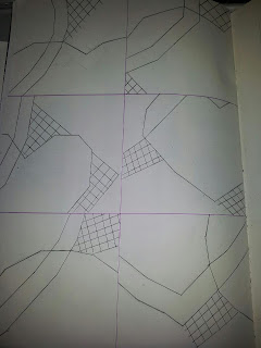

After this, I chose my favourite, which was the first visual, and did 6 thumbnails of it zoomed in at random points to create different patterns and abstract imagery. Here they are: 

I quite like these actually, they look quite abstract and stylized. Next step was to pick one and transfer it onto lino, then begin cutting. I chose the top-right hand design (as seen above.) It was difficult to get the same angles when sketching on the lino but I got there eventually. I started cutting the design out so I will finish next time. 


Here is how to lino-cut for anyone wondering: 
1: sketch a design onto lino (if it is your first time then use simple and angular lines.)
2: Put the lino onto a wooden block ready for cutting.
3: Select the right sized gouge. (wide scoops for thick lines and pointed ends for fine detail.)
4: Dig into the lino with your gouge (CUT AWAY from yourself!) 
5: Begin cutting along your design, try and cut within the same level so it is as even as possible when you want to print. 
6: Be confident... Once it's gone, it's gone!


Sunday, 11 November 2012

Printmaker #2... Trasi Henen!

Apologies if you guys are bored stuff of Printmaking stuff by now, just this one last post about it! :) 

I'm presuming not many of you have heard of this artist called Trasi Henen (based on how not one person in my class knew of her). But I've looked at her work and she's done some pretty cool prints.

Henen is South African and was born in 1981. Her works mainly include painting, mixed media and printmaking (obviously!) She has even won awards for her paintings, but for now we're focusing on the prints.


I don't know exactly why but I love the whole atmosphere and effect of this print. The background colours being blended like they are against the white ink gives the impression of Space, and for me the odd spot of white ink on the page add to this effect because they look almost like stars. The darker colour in the middle of the page causes the sketch to stand out more, giving a somewhat 3D feel to it. I also like how none of the lines are precise , it gives the image life! I could literally say more and more but I'm going to move on now!


Anyone want to take wild guess at the name of this print? ... 'Chairs'! There is an abstract feel to this one, by how she has used the same image again and again, but changed subtle things about it, maybe by changing the angle or leaving some details out. It's very interesting to look at due to the randomness of how the images have been placed; however some people may find it boring because of the predominantly red colours.

I haven't had time to do a print influenced by Henen yet; however if I get round to it, I'd take influence by making the images extremely simple, and not to worry about perfectly drawn lines or positioned images. I'll keep you guys posted (excuse the bad pun!).....

Andy Warhol: in Printmaking

Let's explore Andy Warhol's Printmaking techniques!

Warhol is a well-known Pop Artist, who was born in 1928 in Pittsburgh, Pennsylvania. He trained as a commercial artist and soon began to adopt a style of painting everyday images such as soup cans in bold and sometimes unusual colours (Pop Art).

Andy Warhol's most common form of printmaking was via silkscreen; where he was able to  project a photograph to a silk screen. This allowed him to produce repetitive patterns of the same image, whilst not restricting him to maintain the same appearance... he was able to alter the colour schemes.

Here is an example of his work using this technique. As you can see he has used contrasting and bold colour schemes to separate each box. I like this technique as it is very eye catching, and the use of a simple image doesn't make the heavy use of colour too overwhelming.


Warhol also experimented with monochromatic prints. I thought it would be nice to put one on since we were doing this at college. I know this one has a bit of red ink on it too but we did use that technique so it's still valid! 

I like how he has used three colours for the background to make the image more unique. It gives the image more depth than the image above where only one colour was used as the background. I like this effect of using more than one colour; therefore I've started a print which is inspired by this.

It's a work in progress, but it's okay as it's the background which is influenced. I layed it out into four areas, like many of Warhol's prints. I've also chosen a simple colour scheme of pale pink and yellow; however a third colour is introduced by layering the two colours. 


I shall produce a monochromatic print of Keith Haring's doodles onto here; however they won't be repeated; I wanted to take influence from Warhol but still make it my own, so that's why it wont be a repeat. 

Tuesday, 6 November 2012

Printmaking

Like Andy Warhol and Trasi Henen, we completed various prints today.

Our objectives: 
  • Complete a series of A4 monoprints
  • Variety of techniques: monochromatic and using two separate colours.
  • Annotate and mount in sketchbooks.
  • Learn about de/re contstructing our images.

To make a print, find a copy of the image you want to print, then place this image face-up over a sheet of the material you want the print on over a THIN layer of ink of any colour and trace the image using a biro, pencil, graphite stick or even a finger to pick out the lines you want. Put pressure with your chosen tool but don't lean on the page with your hand as this will result in a hand mark on the page. You could experiment with using different coloured ink or different materials to print on!


These prints had to be relevant to group work we did about an artist; therefore my images had to relate back to the style of Keith Haring. Therefore; I sketched one of his drawings to print.

For this, I filled in with block colours of red and blue for the outlines and the heart. I used a graphite stick for this because it gives a thick, bold line and when used in print making, gives the effect that a wax crayon was used. I think this effect is successful in terms of links to the artist's work, because Haring's images are simplistic with an almost childlike effect; therefore the crayon effect works well with this print. I thought the primary colours would be good as these made up his idiosynchratic colour scheme. I outlined with a biro using black ink to again mimick his style.


I decided to also do a monochromatic print, which was easy to do when taking influence from Haring's style because of his 'subway' chalk drawings. This time, I copied an image and outlined it with black ink using a biro. I then filled in the image (except the white lines) with my finger using black again and around the edges to give the same effect of chalk on a black surface. I like the monochrome because it gives the print a mood and atmosphere. I used newsprint for this monochromatic print as it allows the ink to be transferred easily, but I used cartridge paper for the first one in order to experiment with different materials.


 I really like the effect of this technique; however if I were to do it again, I'd take more care in printing the background more accurately around the image.


Well today was a new experience for me... I found this process to be very open and enjoyable. I dare you guys to try it!