Showing posts with label Visual Techniques. Show all posts

Sunday, 9 June 2013

Typography Shadows

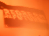
Whilst in the process of making a typography experiment for 
my project, I noticed that I was holding my stencil up to the 
light, and it cast interesting shadows onto the paper.

These experiments are entirely a happy accident. I noticed that the positioning of the light as well as the angle which I held the stencil caused the type to move and become distorted.
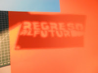
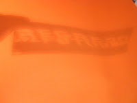
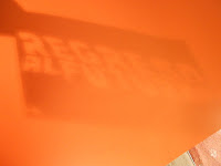


 As you can see, in places the letters fade out or in, and gradients are created onto the surrounding shadow. There are a lot of graphic effects being created through the shadows: silhouettes/ gradient/ movement/density

Since my film is Back to The Future, I thought that the effects created are quite useful, since the idea of wavy or distorted type could symbolise the movement of the car through two time periods. This would be really good and useful if it was a Photoshop project; however the poster needs to be completely hand made and so it won't be possible to create shadow for this project.


 I had the original stencil close to the light here, and I can see a slight orange glow around the letters on the second line.  Again, this looks modern and futuristic which would be useful if we could use software on this project.

Symbolism and Shapes: Road Signs

I'm planning on influencing Cuba for my poster; which will involve
using symbolism to portray Back to The Future. 
To help with idea generation, I'll look at possible meanings of road signs.

Circles: 
Circular road signs give instructions to drivers. If on a blue background, it will be driving instructions such as directions; however if on a white background with a red border, the instructions would be of a warning nature; an example being speed limit signs. 
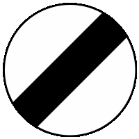
An exception to these rules is the national speed limit sign, as shown below; which has a diagonal line across the centre. 

In generic symbolism, circles could represent spherical objects in an abstract sense; or could show that something is infinite and continuous.


Triangles: 
Triangular road signs denote warning messages, whether it is a driving hazard such as ice or steep slopes; or a general 'watch out' message for children or pedestrians.

In a generic sense, a triangle could represent the relationship (lines) between three things or people (corners). It is quite an angular shape and so could be associated with dangerous situations in terms of film or imagery.


In my designs: 
Here are a couple of designs I produced using shapes or images which remind me of these road signs. They also take influence from Krasnopolski's simplistic style.


              The lesft-hand image focuses more on Krasnopolski's influence whereas I noticed that this right-hand composition contains elements of these road signs. The image represents the clock tower being struck by lightning from Back To The Future. As I thought this was symbolic enough through simplicity, doing this research has helped me draw new symbolic interpretations.

The circle is an outline of orange, a secondary colour to red and yellow. Road signs like this mean to follow instruction as a warning. This can relate to the film as the situation is if Marty can't channel the lightning, (instruction)  he'd be stuck in the past forever (warning). The circle alone has connotations of speed limits - another relevant point as the key speed limit is 88mph in the film.


This research has been very helpful, as it has increased the abstract and symbolic impact of my designs; which makes it more like the Cuban posters. 

Channel Idents

To gain ideas for visual techniques for my film poster, 
I've researched some media such as newspapers, maps and comic books. I haven't yet
looked at digital imagery, hence I have researched some
channel idents.


A channel ident is essentially a television channel's identity to separate itself from other channels. The ident represents the channel in between programmes or either side of the advert breaks, usually in the form of a short animation. Usually there are more than one ident which follow the same features or pattern. Some examples are below: 

BBC 1: idents usually consist of:

  • The logo in the centre of a circle
  • The circle consists of a round object or animated images to create a circle
  • Animation

A rough storyboard/ timeline of the hippo
BBC 1 ident. It begins with hippo's swimming randomly, before forming a circle. The logo appears through animation and the hippo's continuing to swim to maintain the circle. These idents would all be computer generated. 

I like how random things (hippos in this case) have been used to identify the channel. It is quite abstract because of this, but its the circle coupled with the logo which let viewers recognise it.


Channel 4: idents include:
  • A consistent scene - usually outdoors
  • Combination of real-life footage and computer generated images
  • Still components. Instead pans the camera and perspective across to reveal the logo
 Another timeline, this time for Channel 4.
In this scene, the landscape and hay bales there are presumably real footage; however the levitated hay bales would be computer generated. 
With these idents, it isn't the objects which move like the BBC 1 example, but the camera.
The camera slowly pans across the  
 landscape and gradually reveals the logo in 
doing so. 

I like the effect of using perspective rather than more complex animations - it is just as powerful. Because of this, I have learned that more complex concepts aren't always better than simpler solutions. 


Monday, 29 April 2013

Visualisation: Techniques & Evaluation

Well we had a lot going on today; did loads of new techniques!
Happy reading

The outcome for today was to compose a mixed media collage; however before we started, we were shown possible techniques to include: mono-printing, and emulsion photo transfers. 

You've seen it all before; mono prints on my blog. This was like a reminder exercise.

The image shown here is my own sketch of the front of Chesterfield Cathedral, I think this turned out very well considering I haven't done printing in a good few months!

Yes, I could have maybe put more pressure onto the left side but in a way the faded effect adds mood to the print.


Okay, print number two! I'm actually really pleased with this one. It was done from a photograph of some Tudor style buildings in Chesterfield. 

Although the lines aren't very defined, it is still visible to show what it is, but gives an old, weathered quality as well as maybe some ghostly atmosphere. 
With this one, I went over every line with a pencil but did it scruffily so this added to the effect.


Moving on to the photo transfer... Don't know how to do it? Well...
1) Roll out a layer of emulsion paint
2) Place your image FACE DOWN into it and smooth out ALL bubbles on the back
3) Peel off carefully
4) Transfer to a material of your choice and repeat stage 2
5) Wait a couple of hours, and gently rub off emulsion with a damp cloth 


This is my emulsion transfer of Chesterfield Cathedral. It turned out well since only small parts of the image were completely taken off. I decided to leave the remaining smears of emulsion on the image because the grainy effect gives the impression that the photo is very old. I'm quite liking the spooky atmosphere this brings as well! 


So, on to the collage. I don't have the photos of the processes any more, but I will upload the final outcome and you can spot for yourself where things are!

1) I printed off a colour and black and white photocopy of a photograph of the side of the    Cathedral. I chose this because it has an interesting angle. 
2) I combined the two images by cutting out some parts in colour and placing it over the same place on the black and white version to create contrasts.
3) I created a photo transfer of extended lines, which was very faint so I went over it in charcoal so it stood out.
4) I referenced Lyonel Feininger's work to create atmosphere by step 3 and by layering tissue paper in a rough fashion in the sky and on the bricks to add more texture and impact.
5) I added charcoal to the stone tissue paper to bring out the detail, and did the same thing with the sky but added watercolour as well. I did this in a patchy way so mood was created.
6) I made a mono print consisting of two layered images of the Cathedral and placed it in a seemingly random place, but I was trying to add Cubism like Feininger. 


Here we are! I quite like the composition but it adds more mood and effect in black and white:


I began to add colour back into this using watercolours. I chose purple and brown because they represent stone, but they're also quite moody colours. 

Watch out, next week we're using bleach in these collages!