Showing posts with label Film Poster. Show all posts

Sunday, 9 June 2013

Typography Shadows

Whilst in the process of making a typography experiment for 
my project, I noticed that I was holding my stencil up to the 
light, and it cast interesting shadows onto the paper.
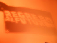
These experiments are entirely a happy accident. I noticed that the positioning of the light as well as the angle which I held the stencil caused the type to move and become distorted.
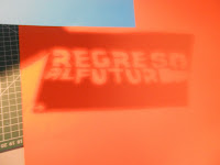
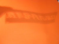
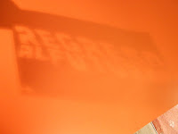


 As you can see, in places the letters fade out or in, and gradients are created onto the surrounding shadow. There are a lot of graphic effects being created through the shadows: silhouettes/ gradient/ movement/density

Since my film is Back to The Future, I thought that the effects created are quite useful, since the idea of wavy or distorted type could symbolise the movement of the car through two time periods. This would be really good and useful if it was a Photoshop project; however the poster needs to be completely hand made and so it won't be possible to create shadow for this project.


 I had the original stencil close to the light here, and I can see a slight orange glow around the letters on the second line.  Again, this looks modern and futuristic which would be useful if we could use software on this project.

Symbolism and Shapes: Road Signs

I'm planning on influencing Cuba for my poster; which will involve
using symbolism to portray Back to The Future. 
To help with idea generation, I'll look at possible meanings of road signs.

Circles: 
Circular road signs give instructions to drivers. If on a blue background, it will be driving instructions such as directions; however if on a white background with a red border, the instructions would be of a warning nature; an example being speed limit signs. 
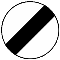
An exception to these rules is the national speed limit sign, as shown below; which has a diagonal line across the centre. 

In generic symbolism, circles could represent spherical objects in an abstract sense; or could show that something is infinite and continuous.


Triangles: 
Triangular road signs denote warning messages, whether it is a driving hazard such as ice or steep slopes; or a general 'watch out' message for children or pedestrians.

In a generic sense, a triangle could represent the relationship (lines) between three things or people (corners). It is quite an angular shape and so could be associated with dangerous situations in terms of film or imagery.


In my designs: 
Here are a couple of designs I produced using shapes or images which remind me of these road signs. They also take influence from Krasnopolski's simplistic style.


              The lesft-hand image focuses more on Krasnopolski's influence whereas I noticed that this right-hand composition contains elements of these road signs. The image represents the clock tower being struck by lightning from Back To The Future. As I thought this was symbolic enough through simplicity, doing this research has helped me draw new symbolic interpretations.

The circle is an outline of orange, a secondary colour to red and yellow. Road signs like this mean to follow instruction as a warning. This can relate to the film as the situation is if Marty can't channel the lightning, (instruction)  he'd be stuck in the past forever (warning). The circle alone has connotations of speed limits - another relevant point as the key speed limit is 88mph in the film.


This research has been very helpful, as it has increased the abstract and symbolic impact of my designs; which makes it more like the Cuban posters. 

Channel Idents

To gain ideas for visual techniques for my film poster, 
I've researched some media such as newspapers, maps and comic books. I haven't yet
looked at digital imagery, hence I have researched some
channel idents.


A channel ident is essentially a television channel's identity to separate itself from other channels. The ident represents the channel in between programmes or either side of the advert breaks, usually in the form of a short animation. Usually there are more than one ident which follow the same features or pattern. Some examples are below: 

BBC 1: idents usually consist of:

  • The logo in the centre of a circle
  • The circle consists of a round object or animated images to create a circle
  • Animation

A rough storyboard/ timeline of the hippo
BBC 1 ident. It begins with hippo's swimming randomly, before forming a circle. The logo appears through animation and the hippo's continuing to swim to maintain the circle. These idents would all be computer generated. 

I like how random things (hippos in this case) have been used to identify the channel. It is quite abstract because of this, but its the circle coupled with the logo which let viewers recognise it.


Channel 4: idents include:
  • A consistent scene - usually outdoors
  • Combination of real-life footage and computer generated images
  • Still components. Instead pans the camera and perspective across to reveal the logo
 Another timeline, this time for Channel 4.
In this scene, the landscape and hay bales there are presumably real footage; however the levitated hay bales would be computer generated. 
With these idents, it isn't the objects which move like the BBC 1 example, but the camera.
The camera slowly pans across the  
 landscape and gradually reveals the logo in 
doing so. 

I like the effect of using perspective rather than more complex animations - it is just as powerful. Because of this, I have learned that more complex concepts aren't always better than simpler solutions. 


Monday, 27 May 2013

Minimalist Film Posters

So for the past few weeks, I've been working on a project to create a hand-made film
poster on a film of my choice along with taking inspiration from a 
country's style of poster

I haven't had chance to upload my research and ideas yet but I will do very soon!


Chosen Film: Back to The Future
Chosen Country: Cuba

I chose this film as it is my favourite film, and I can literally quote along with it, I've seen it that many times. I notice that my designs are thought to be too complicated in past projects, so I chose Cuba because their posters are quite minimalist.


Anyway, it was this minimalistic quality that caught my eye on this newspaper article I found when scrolling through earlier today. It is about a designer called Michal Krasnopolski, who has designed a series of film posters using a series of very simple geometric shapes whilst still making it obvious what the film is. 


Here are two examples of these posters. Like I said, very mininalist! I really love how the shapes are incomplete and quite abstract, but it is so relevant to the film once you read the title. This minimalism is what makes it eye catching, and it causes people to look closer due to the simplicity, along with the title being quite small in comparison.


Two more examples from this series. They are wildly simple but unique and engaging at the same time. The 101 Dalmatians poster is particularly clever as the number being placed this way could also be looked at as a very simple portrayal of a dog. I can see that the artist uses colour to relate to associated colours to the film as well to add more association to his designs.

I'm glad I found this artist because it is relevant to the project brief as a whole, and it relates to the Cuban poster style by being colourful and simple with geometric shapes. I could definitely take influence from him in my own designs.